Monday, April 9, 2012

Table Stylesheets in Flare

I’ve gotten several emails recently asking about table style features in Flare 7 and 8. So this blog recaps the TableStyle Editor and two of its most useful but somewhat unfamiliar features.

When you create a table stylesheet, Flare takes you into the TableStyle Editor, shown below.
The General tab controls table-wide features like table margins, outer borders, cell padding, and so on. The remaining four tabs – Rows, Columns, Header, and Footer, have the same options. They let us set the formatting for different table elements, such as setting the colors and text attributes for alternate rows within the table, as shown above. Useful and simple. (I created the colors shown here for a class to be sure that attendees clearly saw the effect of different settings. I’d be unlikely to use such garish colors in a real project.) Straightforward…

At the top of the TableStyle Editor are two features that were added in Flare 7 and are in Flare 8 – Medium and Apply Style.
The Medium option extends the Medium feature to table styles. (Before 7, mediums were only available for regular CSSs.) A quick recap…

Mediums let us create a single CSS that contains alternate settings for alternate outputs. Say you’ve got a project to be output to WebHelp and PDF. You decide to use Verdana Red 16 pt for the WebHelp h1s and Verdana Black 16 pt for the PDF. You’d expect to create two CSSs in this case, one with the settings for the WebHelp and one for the PDF. If you later decided to add WebHelp Mobile as an output with h1s as Verdana Blue 12 pt., you’d have to add a third CSS. It’s simply, but maintenance gets cumbersome. Instead, you can create one CSS with specific settings for the default output, which you decide is WebHelp, and alternate settings for the PDF and mobile styles. You’re now using one CSS for all three outputs, which is easier to maintain. It’s a very useful feature if you single source. The addition of mediums to table stylesheets simply extends this flexibility.
The Apply Style feature automates several table tasks that are common even if you don’t single source. Clicking the Apply Style button displays the Apply Table Style dialog box, shown here


Prior to this feature appearing in Flare 7, applying a table stylesheet to tables was simple but tedious. You had to apply the stylesheet to each table individually. If some setting in the table stylesheet didn’t work, it was usually due to local formatting in the table, usually introduced when the original author tweaked the table by hand in Flare or Word to get it to look “right”. But local formatting overrides styles, so you had to remove the local formatting either by going into the code or by selecting Table > Reset Local Cell Formatting. Easy, but one table at a time.
The Apply Table Style feature eliminates much of the drudgery in table formatting. You select some or all of the topics in the project and simply tell Flare to apply the table stylesheet to all tables in those topics. You can also tell Flare to overwrite any existing styles in those tables, remove any print styles, and remove all local formatting.

So far, I’ve only found two cases where the Apply Table Style feature didn’t work, neither one being the fault of the feature itself.

The first is when a project has more than one type of table and thus more than one table stylesheet. In this case, Flare has no way of knowing what table stylesheets to apply to what tables. You have to apply the appropriate table stylesheets by hand. This seems like a fairly easy thing to fix by adding some sort of “type” indicator to the tables and then telling Flare to apply table stylesheet A to all tables of type A, table stylesheet B to all tables of type B, and so on. I *think* this has been added as a feature request for a later release.
The second is when importing tables from Word where the author used the first row to hold the column heads. When you import those tables into Flare and apply a table stylesheet, the Flare Header row styles don’t seem to work. The reason is that the original table uses the first row, usually, as a header row but it’s just an ordinary row. It’s not programmatically designated as a header row. So Flare doesn’t know to apply its programmatic Header row style to that row. Fixing this is tedious but simple… select the table, open the Table Properties dialog box, change the number of Header rows from 0 to 1, select the column heads in the table, move them into the “real” Flare Header row, at which point they instantly use the Header row styles, and delete the now empty “header row” from the table.

The only other instance that I can think of where this feature might not work is when dealing with very old Word documents that contain tables that had been hand-tweaked for years. The “reset local cell formatting” feature may have some limit as to the junk code it can deal with but I haven’t found it yet.
All in all, two nicely done features that add a degree of automation to a mundane task in help authoring.

Monday, March 5, 2012

Some Initial Observations about MadCap Flare 8

MadCap released Flare 8 last week. As usual, it has a mix of enhancements to existing features and some interesting new features. Here’s my quick take on what I view as the most significant…

Existing Features

Automatic update of changed element names – In prior versions, all authors had to agree on the name of a variable, condition, or file tag set before inserting it. If you created a variable called custname, for example, inserted it in 500 topics, and then changed the name to customername, the insertions broke and had to be recreated. That changed in Flare 8, where references to a named element are updated automatically. It’s a small change, but it adds authoring flexibility since a misnamed variable name is no longer carved in stone.

Additional print features – The print output features continue to grow, with Flare 8 adding features like the ability to control where page numbers appear for index entries, to suppress page number display for specific levels in a table of contents, to control how a PDF should display when it opens, a better ability to create tables with captions that repeat if the table spans multiple pages, and more. These features increase Flare’s ability to serve as the primary authoring environment for all outputs. However, these features also raise the potential complexity of a project and make it more important than ever to plan a project before starting it and document that plan for reference during maintenance. “Winging it” is less and less realistic an approach for project management.

New Features

ePub output – With the addition of ebooks in ePub format as an output option, Flare now handles two out of the four primary mobile outputs – ebooks and web apps. (But excluding native apps and hybrid apps, which are not an obvious fit for a tool like Flare - for the moment at least.) This, and the added print features, increases Flare’s utility as a central authoring environment. You will still have to validate the ePub code using an external validator if you want to send the ebook to a store, and that’s a jump in technical complexity, but the addition of ePub output is a strong step forward.

HTML 5 output – This is similar to the familiar WebHelp output but more powerful. This format supports the WHATWG HTML 5 format and CSS 3. It adds features that take advantage of the capabilities of new browsers. There are too many features to cover in a short blog post, but some of the major ones include support for SEO (search engine optimization – more about this below), improved “accessibility”, and server-based functionality like the ability to include non-XHTML (topic) files in a search. This is a strong step forward into the era of modern browsers.

SEO (search engine optimization) support – SEO is fairly new and esoteric for many help authors but it’s a reflection of changing trends in technical communication. How? In the past, access to help was usually limited to people who’d bought the application software for which the help had been created – the help was “inward-facing”, aimed at the buyers. People who hadn’t bought the software couldn’t see the help. Google changed this; buyers and potential buyers often did Google searches to find information about or answer questions about the application software instead of using the official help. As this practice spreads, the value of the official help will decline to the point where traditional help authoring may turn into an endangered niche.  The solution is to make the help “outward-facing” – to make sure it can be found via a search and not only found, but listed near or at the top of the search results. One way to do this is to include features that make the help easier to find by webcrawlers. If you’re creating traditional, inward-facing help, SEO isn’t a factor (although it’s worth learning about now.) But if your company is changing its online help strategy to an outward-facing one, SEO support features are going to become important immediately.

More posts in the near future but, overall, a very nice job.


Sunday, January 22, 2012

A Mobile App Usability Tale…

It’s often taken for granted that mobile apps are so simple that they don’t need online documentation or help. That may be true but it’s risky to assume that that’s always true. Here’s a case where it wasn’t.

There’s a game called Fruit Ninja (thanks, Sandra, I think…), also available on the iPhone. The object is to slice flying fruits in half with a sword, represented by your fingertip on the iPhone. The kicker is that the game periodically throws bombs at you. Slicing a bomb detonates it and ends the game.

I mentioned Fruit Ninja to a friend, who’ll remain nameless to spare him a lot of teasing (except from me, of course). I was on the phone with him last week and the subject turned to Fruit Ninja. He said it was fun but “what are you supposed to do with the damned bombs?”
It turned out that he had assumed that he was supposed to slice the bombs, like the fruit, but that there was a special way to do so to keep them from exploding. There isn’t. Hit them and they explode, period. I explained how to handle the bombs; he used several four-letter words, and said thanks…
I don’t want to read too much into this incident. This may be the only time it’s even happened. But this guy is a systems engineer for a large aerospace company, very bright, and he still misinterpreted the interface. My point is simply not to assume that everyone will understand how to use a mobile app.

Tuesday, September 13, 2011

Mobile eCommerce in Northern Vermont

My wife and I were on vacation in northern Vermont last week and happened to stop at a farmer’s market in Morrisville. While I was wandering around, I stopped at a booth run by a woman selling meat and, after some discussion about the offerings, learned that she took credit cards by running the cards through a plug-in swipe unit from Square, at https://squareup.com/, that attached to her iPhone.
Two things struck me about this.
  • The fact that mobile ecommerce has penetrated a small town in Vermont with no high-tech tradition. In other words, mobile ecommerce is becoming ubiquitous.
  • The simplicity of the equipment and configuration. (See the Square site.) The woman said she wasn’t a techie, but found the equipment and the service a snap to use.
It's an increasingly mobile future...

Thursday, August 18, 2011

Integrating Native Mobile Apps and “Help”

We often view native mobile apps and online help/doc as distinct and separate types of online outputs. (And we can create online help/doc, which I’ll simply refer to as “help” from here on, in three “mobile” forms – mobile-optimized WebHelp, regular WebHelp viewed on a mobile device, and ebooks. So it’s crucial to define what we even mean when we talk about “mobile”.)

Can we connect these mobile types of “help” to native apps to add online help to the apps? That’s the subject of this paper – connecting native apps to “help” in the form of mobile-optimized WebHelp like Flare’s WebHelp Mobile.
But why bother? Native apps (Flixster, CamCard, etc.) are supposed to be so easy to use that they don’t need online help. But that’s not always true. Some apps have “hidden” interface features that must be documented. Others may require “domain” knowledge that has to be made available to users. We can provide some of this information within a native app, but native apps aren’t designed to handle large amounts of text. So how do we make help or domain knowledge available to mobile device users?

This paper answers this question by looking at three topics:
·         Definitions – What’s a native app?

·         Usage flow  – How do native app users need to move between an app and its help? How can we make that happen?

·         Design – What design criteria do we need to consider when interfacing native apps and help?
In this paper, I’ll show the specifics of interfacing native apps to “help” using two tools, an app creation tool called MobiFlex (http://mobiflex.me) and Flare (http://www.madcapsoftware.com) as the “help” creation tool, with a focus on the WebHelp Mobile output created in Flare 6 or 7. (If you don’t use Flare or MobiFlex, use the concepts as the basis for talks with your IT group.)

Definitions

Terminology misunderstandings often cause problems so, before proceeding, some definitions:

·         App – Short for application but usually used in reference to mobile devices – e.g. “iPhone app”. Apps usually focus on one task, unlike feature-rich, often sprawling PC applications.
For this paper, I’ll define two types of apps:

·         Native – Reside on the mobile device, are written in the device’s native language, and can use the device’s native resources  – camera, accelerometer, GPS, etc. If the app collects or refers to data, that data can be on the device or on a server that the device accesses via the Internet.

·         Web – Run in a browser on any device from a smartphone to a PC. WebHelp Mobile is basically a web app, which means that a native app should be able to link to it via a standard web link.
(A third type, hybrid, are native apps that run primarily in a browser but communicate with the device’s native resources (camera, etc.). I’m not covering these apps in this paper.)

With these definitions, let’s assume you created a native app for an iPhone or Android using MobiFlex and need to connect it to “help” created in Flare’s WebHelp Mobile format.

How To Connect a Native App to a Web App


For this paper, I’ll postulate two styles of help connection – “Help-menu” and “context-sensitive.”
Help Menu-Style

This style can simply be a link from the home page of an app to the home page of the WebHelp Mobile, similar to the Help > TOC option in a standard Windows application. For example, tapping the WebHelp Mobile button in the screen below:


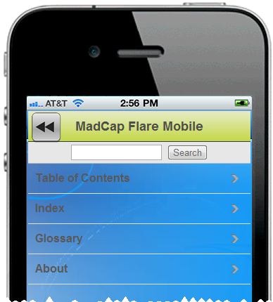
…opens the WebHelp Mobile by launching a hyperlink to the URL of the WebHelp Mobile home page, shown below:


Once in the WebHelp Mobile, users can access the navigation featured defined in the WebHelp Mobile skin – Table of Contents, Index, etc. But how do users go from the WebHelp Mobile back to the app page where they launched the WebHelp Mobile? The solution is to add a “back” button, such as at the one at the upper left corner of the screen below.


This is easy. But what if you need more buttons? They’ll cover the WebHelp Mobile title bar. You could fix this by resizing and moving the window in which the WebHelp Mobile displays, as shown below.


This layout is similar to the previous one, except that I moved the WebHelp Mobile window down to add room for buttons without overwriting the WebHelp Mobile title bar. However, if all you need is a “Back” button, then this approach wastes a lot of already-limited screen space. It depends what you need to do. (You could also use a smaller button image for a better visual fit on the screen, as long as the button was still large enough to be easily tapped with a fingertip.)
Context Sensitive-Style

Context sensitive-style is similar to the Help menu-style above, with one big difference. The Help menu-style assumed you’d always go to the help from a specific app page and always return to that app page. This meant the “back” button could simply be a URL link to that app page.
Context sensitive-style still takes you from an app page to the help but the “back” button must now take you back to the app page where you launched the help, which may differ each time. This means that the “back” button can no longer be a URL link to one app page. Instead, it has to know your path through the material in order to provide a “back to previous” function. How you do this depends on the code you insert or the tool you use to create the app. (I’m assuming here that you created the help using Flare.) If you’re using MobiFlex’ visual authoring, here’s what the options look like:


This is the property sheet for an image button. The important part is the dropdown with “Go to previous page” selected. That’s all you need. It means that each page in an app can link to a page in the WebHelp Mobile. After users enter the WebHelp Mobile, move around it by using the WebHelp Mobile navigation features, and then decide to return to the app, tapping the “back” button takes them to the app page where they invoked the WebHelp Mobile in the first place. All controlled with one “back” button on the WebHelp Mobile page. The result is effectively context-sensitive help for the app pages.
Some Design Considerations

This process is mechanically straightforward, especially if using Flare and MobiFlex. But there are some design considerations to keep in mind. Here are three major ones:
·         Should the app and the help look alike? It depend on your needs. You might say yes, to maintain visual consistency in the interface, or no, to visually distinguish the app from the help.

·         If the app supports orientation shifting – e.g. shifting from portrait to landscape mode if the user moves the phone, should the help orientation shift too? If it doesn’t, might users get annoyed as they have to rotate the phone 90° each time they switch between the app and the help?

·         Flare authors tend to think in landscape mode, but mobile devices may be portrait oriented. This means that Flare authors must create projects that can easily shift from the landscape mode of a PC screen to the portrait mode of a phone. That means using relative measures like % or em instead of points in the CSS.

You’ll probably find more specific issues of your own.

Summary


This simple visual approach (based on using tools like Flare and MobiFlex), breaks down walls between native apps and web apps like WebHelp Mobile. It lets technical communicators start creating online help for native apps, like we did for PC applications twenty years ago. It extends the capabilities of both tools. And technical communicators who become familiar with tools like MobiFlex can extend their skills into native mobile app development. The result is greater and more flexible development capability.
Note – If you’d like to see the app and WebHelp Mobile in action or see the underlying code, contact me at nperlin@nperlin.cnc.net and I can activate the app for you to try on an iPhone 4 or Android 2.2 phone or show the coding in MobiFlex.

Note - This post is also available on the MadCap Software site at http://www.madcapsoftware.com/company/industrybuzz.aspx

Friday, August 12, 2011

Answers to Last Questions From 8/10-11 Flare CSS Class

Hi folks,

Here you go...

Re where else to find the description of the mc commands – download the Flare Styles Guide PDF (see the link in the footer in any Flare help topic). The commands were apparently added recently.

Re the topic popup style customization, covered on pg. 61 of the wokrbook, not working – the instructions in the workbook are correct. Tech support took a look, reapplied the popup style, and it worked. So either I misapplied the popup style to the link text or else I accidentally turned it off and didn’t notice that I’d done so. One of those forehead-slapping events that I mentioned.

Cheers,
Neil

Friday, June 17, 2011

Presenting Two Webinars On Mobile for MadCap Software

Mobile has become a hot topic in the last few years, and you may be thinking about using it for your online help and documentation. But what benefits does it offer? For what kind of applications? What’s the difference between web apps, regular web sites, native apps, and ebooks, and how might those differences affect your mobile strategy?

You could buy and learn brand new types of software for creating mobile, with the effort and expense that entails. But if you have Flare 6 or 7, you’ve got an alternative – you can convert existing projects to mobile form with minimal expense and effort by simply using a few new Flare features and using some familiar Flare features in new ways.

This two-part webinar explores both issues – the general mobile “ecology” to provide a framework for your mobile strategy, and the specifics of creating mobile output using Flare.

Part 1 – “Native Apps?” “Web Apps?” What IS This Stuff? – An Overview of the Mobile Ecology

Part 1 looks at the general mobile ecology. We’ll review the rationales for and benefits of using mobile, some basic terms (feature phones vs. smartphones), delivery “mechanisms” (apps vs. sites vs. ebooks, etc.), major platforms (Android, Apple, etc.), the effect of device differences (such as how differences between smartphones and tablets may affect your choice of delivery mechanism), and suggestions on developing content strategy and standards, and market research to determine your direction.

Part 2 – “So How Do I Use Flare To Go Mobile?

Part 2 looks at the specifics of creating mobile output with Flare. We’ll review the overall process of converting a Flare project to the WebHelp Mobile output and look at typical results – what features convert well, poorly, or not at all, and the effect on workflows and project planning. Finally, we’ll do a live demo to see the process in action.

Part 1 - Jul 22, 10:00-11:00 am (Pacific Time)

Part 2 - Jul 27, 10:00-11:00 am (Pacific Time
)

To sign up, go to http://www.madcapsoftware.com/demos/webinars.aspx