Tuesday, June 1, 2010

Adobe RoboHelp’s Mobile Output

Continuing my look at help authoring tool-based mobile output, we turn to RoboHelp 8.

RoboHelp mobile output uses the International Digital Publishing Forum (www.idpf.org) ePub standard. This means the output can run on any device that supports ePub, like the Barnes & Noble Nook, Android devices with ePub readers, Kindles (with some extra work that doesn’t involve RoboHelp – see http://kindleworld.blogspot.com/2009/08/ million-free-google-books-in-epub-for.html) and others.

RoboHelp creates mobile output using a script that you import into RoboHelp itself. (This is similar to how Adobe added AIR support to RoboHelp – using a plug-in in v.7 before adding it to the interface in v.8. If the mobile market takes off, I’d expect to see Adobe follow the same path and build the script into the interface in v.9.)

What follows is an overview of what’s involved mechanically and design-wise in converting a fairly standard project to mobile format. The project is a proof-of-concept I created for a Boston-based maritime historical to which I belonged from 1990 to 2003. Members of the group built museum-class ship models, and my idea was to create an online “book” about the models and have it sold in the museum store as a fund raiser for the group.

Here’s the main screen and default topic:


And here’s a fairly typical topic screen.


The project had a TOC, index, header and footer in one topic, breadcrumb trail, table and graphics, internal links, an external link, popups, and an audio file. My question was how well the project would convert to mobile with no effort on my part.

The first step is to download the ePub generator script and a file archiver, both free. (See Ankur Jain’s blog at http://blogs.adobe.com/techcomm for instructions.) A few caveats – you’ll have to change the name of the script file to ePubGenerator.jsx and modify the script – a minor step into code – to specify where you put the file archiver on your PC. You can then import the script into RoboHelp using the Script Explorer. Finally, you have to change the XML handler using RoboHelp’s XML support feature.

You can then open the project to be converted to mobile format and run the script. After you specify the output folder, RoboHelp will create the ePub output. Here’s the result in Adobe’s ePub viewer – Digital Editions. First the main screen and default topic:


And the topic.


The result? Mechanically, pretty good. Without making any changes to the initial project, here’s what I got…

• Text converted correctly, as expected since ePub offers “reflow” of text. The text also resized correctly when I used the resizing options on the viewer.

• The TOC came across fine.

• Internal jump links worked fine. External jumps worked too, but opened the target pages in a new browser window. This is okay if your users will read the book in a full browser, like Firefox with the ePub reader add-on, but not if users will read it in a “true” reader. Popups did not work, which I assume is because ePub doesn’t support them.

• Graphics seemed to come across fine.

The problems I found seemed to have more to do with apparent incompatibilities between help project features and the ePub standard, and design.

• The index didn’t convert. I’m not sure if this is because ePub doesn’t offer one or because of something that simply hasn’t made it into the conversion script yet.

• The search tab didn’t convert. It was replaced by the ePub viewer’s search tool, as can be seen, with some difficulty in the images above, at the end of the toolbar.

• One oddity – the project apparently converted to one text file when viewed in the Digital Editions viewer but individual topics when viewed in Firefox. I assume there’s a reason for this that I simply haven’t found yet.

• Projects meant to be single sourced to ePub, in addition to any other outputs, need greater and more rigorous use of CSS. Basically, avoid local formatting – good advice under any circumstances.

• Adobe recommends setting sizes as % rather than the usual points. You’ll have to do this for everything, not just text. Also, don’t use hard returns for paragraph or table row separators because these double when rendered in ePub. (Compare the paragraph spacing in the pre- and post-conversion versions of the default topic, and the spacing of the table rows in the pre-and post-conversion versions of the ship topic.) Instead, specify the spacing as part of the style for the items in question.

• There are also some formatting requirements described in Ankur’s April 23 post.

Finally, as you’d expect when converting content from big-screen to little screens, you’ll have to decide what content is “need to know” versus “nice to know,” such as graphics, and be prepared to conditionalize out the latter. You can fit many graphics in the mobile output by making their sizes relative, with the % unit of size, but a graphic may become small enough to be illegible. Think of this as single sourcing taken to an extreme level.

The biggest benefit of this support for mobile output is the fact that it makes it easy to try mobile without buying and learning new software. And, if you don’t like the result or it’s not what you needed, just delete the output, delete the script (or just ignore it), and go back to your regular output.

And, again, it’s challenging and fun to figure out how to output to mobile…

Friday, May 28, 2010

Upcoming mlearning (Mobile Learning) Conference

mLearnCon, a mlearning (mobile learning) conference in San Diego June 15-17:

http://www.elearningguild.com/mLearnCon/content/1603/mlearncon---home

Thanks to Cheryl Landes

Thursday, May 27, 2010

Interesting Review of the iPad in Time Magazine

Here's the link - www.time.com/time/business/article/0,8599,1976932,00.html

Thanks to Deb Sauer, Deborah Sauer Consulting

Wednesday, May 26, 2010

TE SIG Mobile Content Session - Demos via GoToMeeting

As I said at the TE SIG meeting last night after my laptop wouldn't sync up to the projector, I'm going to show the live demos of various authoring tools and emulators via my GoToMeeting account instead.

In order to try to take people's schedules into account, I'm going to run the demo twice in 45 minutes sessions on the following days:

Wednesday, June 2, from 9 to 9:45.
Friday, June 4, from 1 to 1:45.

If you can make either of these sessions, email me at nperlin@nperlin.cnc.net and I'll send you the meeting ID. If you can't make either of these sessions, let me know at the same email and we'll try to work something out.

Friday, May 21, 2010

MadCap Flare Goes Mobile

In a recent post, I discussed how RoboHelp 8 has added support for mobile output. In this post, I’ll look at Flare 6 and its support for mobile output. Again, some background about the mobile space…

Mobile debuted in the early ‘90s with Apple’s Newton. Newton was revolutionary, but its problems turned it into a footnote in computer history. Windows CE Help and Wireless Markup Language followed several years later, but failed in the mass market for, in my opinion, three reasons. One was an unattractive output, shown below in a real screen from a presentation that I gave in 1998:


That problem has been corrected, as evidenced by the examples below – iPhone apps for star charting and birding:


Another problem was that vendors didn’t know what content to offer so they offered anything, much of it “fluffy” novelties whose charm wore off quickly and that lacked staying power for the mass market. Many apps today share that problem, but there are a lot more apps so there’s a better chance of finding something good amid the fluff.

The third problem in ‘98 was a rough authoring environment, often requiring hand coding. Authoring can still be difficult, but there’s a decade’s worth of improvement in the tools.

So, in general, mobile has become easier to create and more attractive to use.

For today’s technical communicators, there’s a new problem however. Do we create apps, or help or doc to be read on mobile devices? App development is new for many technical communicators and can take them into unfamiliarly complex authoring issues. But the help authoring tools, or HATs, offer another approach – letting us put online content into a format that works on mobile devices and either stands on its own, like an online procedure manual for use in the field, or help for a real mobile app. (If you think today’s mobile apps are so simple as to need little or no help, you’re right. But as mobile device power keeps increasing, I expect increasingly powerful apps to appear that will need help.)

Flare offered mobile output as an option in the interface when it released v. 6 in March. In this post, I’ll give an overview of the feature set and results. Another article will appear in a forthcoming issue of the Communicator, the journal of the ISTC (Institute of Scientific and Technical Communications) at www.istc.org.uk.

Flare 6 supports mobile output through its WebHelp Mobile output target. The target is integrated into the Flare interface, so using it mechanically simply involves creating the target, selecting WebHelp Mobile as the output type, setting or selecting various options, and generating the output. Most of the options are familiar ones in Flare, such as skins, TOCs, CSS mediums, and so on.

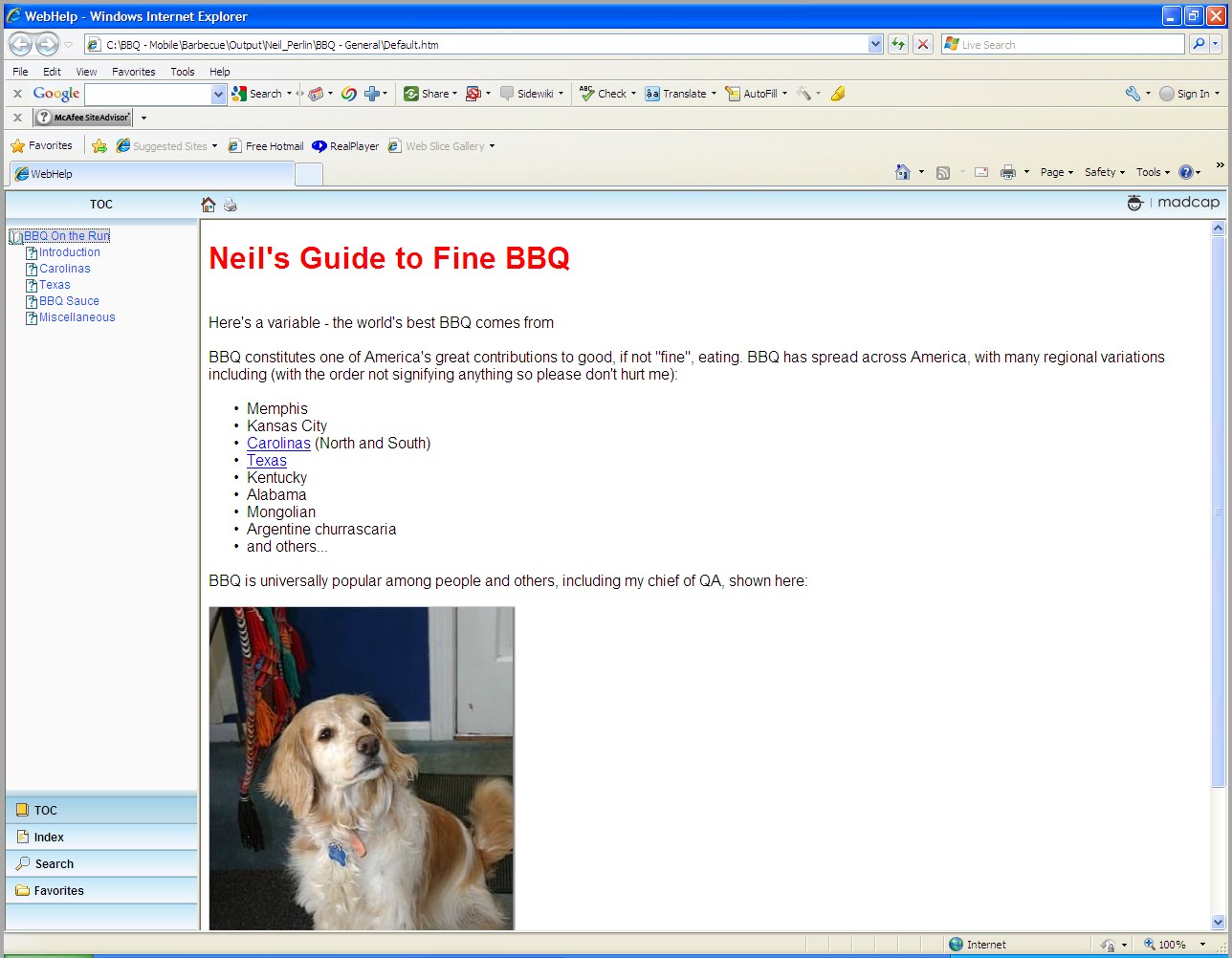
How well does it work? Here’s my test project, output as standard WebHelp:


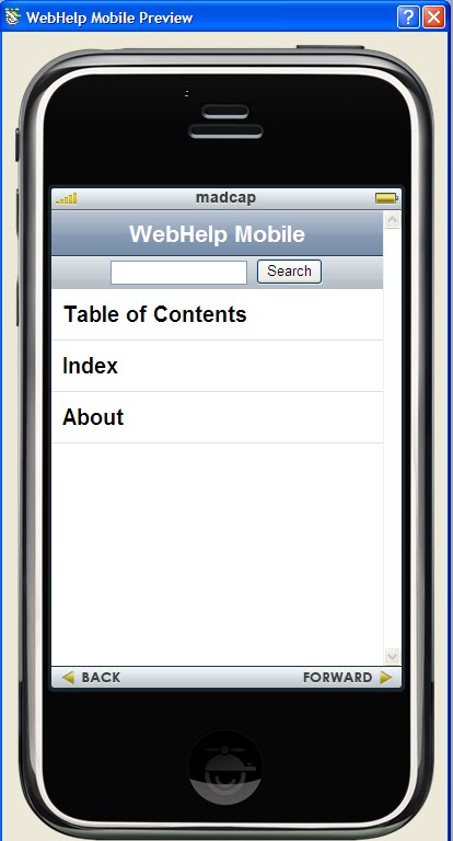
And here’s the same project output in mobile form:


What’s striking about this test is that I made no changes to the project except for the skin settings; Flare just gave me the material in a different format. This has strategic effects for development. If you’ve wondered what your online help or doc would look like in mobile form, you no longer have to buy and learn new tools. Instead, just select mobile as the target. And if mobile proves not to be what you need, just delete the mobile target and try something else. In other words, there’s no risk to trying mobile.

More specifically:

• WebHelp Mobile produces a “mobile site” rather than a “mobile app” so it’s not tied to a specific device. It’s simply a web site accessible from any device with a microbrowser.

• The code is “pared-down” XHTML, so it’s open-source.

• WebHelp Mobile automatically adjusts to a microbrowser’s features. For example – no JavaScript support means no search capability or dynamic text features. This automatic adaption to the microbrowser’s capabilities simplifies project planning, design, and management.

• Flare has pre-defined mobile skins, so skin definition is just point-and-click.

• There’s a generic emulator to preview WebHelp Mobile, shown below:


• All standard navigation options are available on the home page, as shown below.


Mechanically, outputting a project to mobile is a snap. The problems arise in design. This isn’t a problem in Flare but rather in the need to fit output designed for large-screens onto a screen the size of a sticky note. My test project has a fairly typical feature set. Here’s a summary of what happened on conversion…

• Text and variables (which are text) converted smoothly because they reflow to fit the screen sizes.

• Objects that are too big converted but added horizontal and/or vertical scrolling. (Scrolling reduces usability but isn’t necessarily evil, but avoid combining both types of scrolling at the same time if you can.) You can expect this problem with tables, graphics, drop-downs and togglers that contain tables or graphics, master pages, wide head styles, and SWFs. Snippets and project import link items can also be troublesome because they may have the same problems but you won’t “see” it as you insert them – basically “out of sight, out of mind.”

• Popup links converted to jumps. Some microbrowsers don’t display popups, so making the popups work as jumps supports the lowest common denominator microbrowser.

• The only other problems I’ve found or heard about so far are due to the limitations of the display devices themselves. For example, WebHelp Mobile should be able to use a regular project’s header and alias files to create context-sensitive help for mobile apps, but the device must support multitasking or else opening the help closes the app.

• Finally, there’s the design problem of deciding what information to omit from the mobile output.

Except for the last point, you can deal with most of the other problems by making fuller use of Flare features. For example, style properties should be relative rather than absolute – % or ems for text size instead of points for example. This isn’t unusual for text, but what may be unusual is the need to do so for tables and images. (You’ll want to create a CSS medium for the mobile output.) For example, here are two versions of the same page, one with the graphic displaying at its default size and the other with the height and width set to 50%. Note how the second one eliminated the horizontal scroll bar.


This isn’t that difficult, but it will require you to look more closely at your styles and properties and maybe try some features of the Stylesheet Editor that you’ve ignored until now. You’ll also make greater use of conditionality, and perhaps variables in order to use full names in the regular output but abbreviations in mobile. You may also have to re-evaluate your content to determine what’s really needed and what’s there because it’s cool and you had the screen space to indulge yourself. And so on…

If you’re a Flare shop and considering mobile output, you’ll find that the mobile target will push you into new areas of information design in general and Flare’s feature set in particular. And it’s fun…

Tuesday, May 18, 2010

Open Questions From Single Sourcing Class in Canada on May 13

Here are the answers to the open questions from the Single Sourcing class in Scarborough last Thursday, May 13

In what format does Flare output PDF – Adobe.

Do mathematical expressions convert correctly – Depends on the version of Acrobat you have. Check your version's specs.

Do custom templates have to be in the My Documents/My Templates folder – Yes in Flare through v.5. V.6 now lets you put templates wherever you want by using the Template Manager dialog box, available by clicking the Manage Templates icon on most Add New… dialog boxes.

Can you physically exclude topic files (.htm) from the output folder – Conditionalize the topic at the topic level, not at the content level in the topic, and then exclude the condition from the build to physically remove the topic’s .htm file from the output folder. This did NOT work the first time I tried it, but it did when I tried it twice more so I assume I missed a setting the first time.

Can you have topics’ content output to print without listing the topic in the TOC in Flare – No. Flare uses the TOC to select and sequence the topics to output to print, so removing a topic from the TOC in Flare removes that topic’s content from the output. You can work around this by leaving the topic in the Flare TOC for output to Word, then removing the topic’s content from the TOC in Word.

Thanks to Alvaro in tech support for several of these answers...

Wednesday, May 12, 2010

May 25th Boston STC SIG Meeting on Mobility and Tech Comm

This is a reminder about the Technical Editing SIG presentation that I’m doing for the Boston chapter of the STC on May 25 in Natick, MA. (See the chapter site for the address, times, and directions - www.stcboston.org/sigs/te_sig_may2510.shtml.)

I’ll start by discussing the rationale for mobile content, and for tech comm to be creating that content as part of our regular role. Then the history of mobile, briefly – one slide, followed by three reasons why mobile information may succeed this time.

I’ll then cover three target options, two architecture options, and two dev options, with the dev options focusing on using HATs like Flare or RoboHelp to create mobile content vs. using dedicated mobile web authoring tools. Finally, I’ll look at what standard online content design elements work or don't work in the HAT-created content and how we’ll have to change some ways in which we work in order to fix those things and add mobile to our repertoire.

I’ll also demonstrate a number of readers and emulators including, at the moment but not officially, MadCap’s WebHelp Mobile viewer with content from Flare 6, Adobe’s Digital Editions ePub emulator with content from RoboHelp 8, an Android emulator, a quasi iPhone emulator, Firefox in small-screen rendering mode, and whatever other tools I can set up between now and the 25th.

And if you're interested but can’t make it, email me and I’ll send you the slides.

This stuff is fascinating...