If you use MadCap Flare, Adobe RoboHelp, and probably any other HAT (help authoring tool), you may have noticed the intriguingly-named Mark of the Web option in the output settings. Mark of the Beast jokes aside, what is this?
If you use IE 7 or 8 (and some earlier service packs), you know that after you generate a browser-based output like WebHelp and then try to view it, the output doesn’t display. Instead, the browser opens with a yellow bar that reads “To help protect your security…” just above the display area. To view the output, you must click on the blocked content bar, click the Allow Blocked Content… option, and finally click Yes to the security warning message. Only then does the output display.
The blocked content… feature has nothing to do with help authoring per se. It’s a security feature in IE that has the side effect of blocking the display of HTML and XHTML files, which the help topics are, when you run them from your local PC. Where help authoring is concerned, it’s harmless but mildly irritating. Selecting the Mark of the Web feature, often referred to as MOTW, lets you deal with that irritation by turning off the blocked content bar and displaying your output immediately.
According to MSDN…
“The Mark of the Web (MOTW) is a feature of Windows Internet Explorer that enhances security by enabling Internet Explorer to force webpages to run in the security zone of the location the page was saved from—as long as that security zone is more restrictive than the Local Machine zone—instead of the Local Machine zone. When you are developing webpages, the MOTW enables you to test your HTML documents in the security zone where you intend the pages to run. Adding the MOTW to your webpages also enables you to fully test their compatibility with users' security settings.” (http://msdn.microsoft.com/en-us/library/ms537628(v=vs.85).aspx)
So why not turn on MOTW all the time? The blocked content bar only appears when you view your output or HTML/XHTML files on your local PC. It does not appear when you view your output or HTML/XHTML files on a network drive or server. So if users will view your output on a network drive or server, there’s no reason to use MOTW. If users will view your output locally, on the C drive, for example, you might use MOTW. But be aware that MOTW also causes two odd problems in help authoring:
• If you created links in your topics and turn MOTW on, those links don’t work when you preview topics in your HAT. Confusingly, however, they do work in the output. So there’s the risk of wasting time trying to figure out why the links don’t work except when they do.
• If you created links in your topics to external files like PDFs and turn MOTW on, the external links don’t work in the preview or output. They look fine… they just don’t work. So, again, there’s the risk of wasting time trying to figure out why regular links do work but external links don’t. It’s a problem whose solution – turn off MOTW – is simple but totally unintuitive.
The upshot… You might want to turn MOTW on during development to avoid having to click through the blocked content bar each time you review the interim output. Just be aware of the authoring problems and be sure to turn MOTW off when you generate your final output.
Thanks to Jerry in San Jose and the crew is Brisbane for motivating me to finally write this. :-)
Low-gibberish overviews of online content technologies, tools, and methodologies to answer the popular question "What the heck is...?" Topic suggestions always welcome...
Thursday, March 24, 2011
Saturday, March 12, 2011
What’s New in Flare 7 – QR Codes
Continuing my posts about features in version 7 of MadCap Flare… Here, I’ll look at one of the more unusual features – QR Codes.
QR codes are one of those features that’s so unusual that the first reaction is “um, yes…” followed by “Whoa!” (Another such feature is the toggler link.) If you’ve recently seen something that looks like this, you saw a QR code.
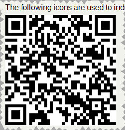
Think of QR codes as an expanded form of the familiar bar code. QR (Quick Response) codes were created, according to Wikipedia (http://en.wikipedia.org/wiki/QR_Code) by Toyota subsidiary Denso-Wave in 1994 for parts tracking during manufacturing and are read by dedicated readers for manufacturing. But what makes them interesting for tech comm is the spread of smartphones equipped with readers. Scanning the code above on my smartphone registers a link to my web site at www.hyperword.com. Clicking that link then jumps to the site, without having to physically type a URL.
What can you do with QR codes? Here are some examples, starting with three from the “About QR Code” topic in the Flare online help:
• You want to give users the ability to jump to your company web site from a PDF or print manual. You could list the URL for users to type, but instead you insert a QR code containing the URL. Users can simply point their smartphones at the code to read the URL, then launch it.
• You’re creating a quick reference guide. Like all such guides, it sharply limits the amount of information you can include, so you give users access to further details by inserting QR codes in the quick reference that link to the full documentation in the form of a WebHelp-based help system on a server. Or the codes might jump to web pages running videos or SWF movies showing how to perform a related task mentioned in the quick reference.
• You could use the codes as a sales tool. For example, you put a QR code on the cover of a sales brochure. When readers scan that code, it takes them to a web page where they can order your product.
And from my own experiments, experience, and research, use it:
• As a brand differentiator – like a sales tool but one that says to certain audiences that you’re cooler than your competitors.
• As a sales tool in situations where prospective customers can’t write down your information because they’re driving or hanging onto a strap on a subway. (I recently saw a two foot high QR code painted on the back of a delivery service truck. If I was interested in the service and had my smartphone at hand, I could have simply scanned the code and gotten the URL for the company.)
• For marketing with response tracking. There are a number of useful threads about this on the Mobile Content group under LinkedIn.
• For any other case where it’s just inconvenient to type a URL. (I have large hands and find it very difficult to type on a smartphone keyboard, virtual or real. I’d find a QR code a helpful substitute.)
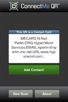
How to read QR codes on your smartphone? Easy – get a reader app from your vendor’s app store/market. I have two, ConnectMe QR for my iPhone 4 and Google Goggles for my Android phone, a Samsung Captivate. Both worked like a charm, and are free. Start the app, point the camera at the QR code, and wait a few seconds. Each app read the QR code and popped up the information on the screen. For example, the QR code I showed above is for my web site at http://www.hyperword.com/. Here’s how the ConnectMe QR app read it off my laptop screen in about a second:
So how do you create these codes using Flare? It’s almost the same as inserting a graphic, the difference being that you can actually see Flare’s QR code generator create the code as you specify the code’s content. To do this:
Click in a topic where you want to add the code and select Insert > QR Code. In the Insert QR Code dialog box, select the content type – Text, URL, Email…, Contact Information, or SMS. The dialog box settings change accordingly. For example, if you select Text, Flare simply waits for you to start typing. However, if you select Contact Information, fields appear for Name, Company, and so on. Fill them out and you’ll see the code taking shape in the Preview pane.
You can also control the size of the code, which may be handy if you create one with lots of information that may be read in shaky or blurry environments. For example, I found that when I entered some marketing text (see the next paragraph) and used the default code size, both my readers took longer to interpret the code than they did when I enlarged the code. I’m not sure if that was the reason why but the difference was noticeable. Finally, you can attach a style class and a screen tip to the code and set display elements like position, borders, margins, and a background.
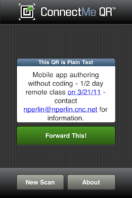
Is there a limit as to how much you can put into a QR code? Yes, depending on the nature of the content - 4296 alphabetic characters or 7089 numeric characters, with some variations - according to an article at http://qrbcn.com/imatgesbloc/Three_QR_Code.pdf. It should be enough for many uses. Here, for example, is a marketing piece about an upcoming mobile app authoring class that I’m teaching – “Mobile app authoring without coding – ½ day remote class on 3/21/11 – contact nperlin@nperlin.cnc.net for information”
Here’s what the code looks like:

And here’s the perfect result:
I’m not sure yet of everything for which I might use QR codes, but I can see a lot of possibilities.
More to come…
QR codes are one of those features that’s so unusual that the first reaction is “um, yes…” followed by “Whoa!” (Another such feature is the toggler link.) If you’ve recently seen something that looks like this, you saw a QR code.

Think of QR codes as an expanded form of the familiar bar code. QR (Quick Response) codes were created, according to Wikipedia (http://en.wikipedia.org/wiki/QR_Code) by Toyota subsidiary Denso-Wave in 1994 for parts tracking during manufacturing and are read by dedicated readers for manufacturing. But what makes them interesting for tech comm is the spread of smartphones equipped with readers. Scanning the code above on my smartphone registers a link to my web site at www.hyperword.com. Clicking that link then jumps to the site, without having to physically type a URL.
What can you do with QR codes? Here are some examples, starting with three from the “About QR Code” topic in the Flare online help:
• You want to give users the ability to jump to your company web site from a PDF or print manual. You could list the URL for users to type, but instead you insert a QR code containing the URL. Users can simply point their smartphones at the code to read the URL, then launch it.
• You’re creating a quick reference guide. Like all such guides, it sharply limits the amount of information you can include, so you give users access to further details by inserting QR codes in the quick reference that link to the full documentation in the form of a WebHelp-based help system on a server. Or the codes might jump to web pages running videos or SWF movies showing how to perform a related task mentioned in the quick reference.
• You could use the codes as a sales tool. For example, you put a QR code on the cover of a sales brochure. When readers scan that code, it takes them to a web page where they can order your product.
And from my own experiments, experience, and research, use it:
• As a brand differentiator – like a sales tool but one that says to certain audiences that you’re cooler than your competitors.
• As a sales tool in situations where prospective customers can’t write down your information because they’re driving or hanging onto a strap on a subway. (I recently saw a two foot high QR code painted on the back of a delivery service truck. If I was interested in the service and had my smartphone at hand, I could have simply scanned the code and gotten the URL for the company.)
• For marketing with response tracking. There are a number of useful threads about this on the Mobile Content group under LinkedIn.
• For any other case where it’s just inconvenient to type a URL. (I have large hands and find it very difficult to type on a smartphone keyboard, virtual or real. I’d find a QR code a helpful substitute.)
How to read QR codes on your smartphone? Easy – get a reader app from your vendor’s app store/market. I have two, ConnectMe QR for my iPhone 4 and Google Goggles for my Android phone, a Samsung Captivate. Both worked like a charm, and are free. Start the app, point the camera at the QR code, and wait a few seconds. Each app read the QR code and popped up the information on the screen. For example, the QR code I showed above is for my web site at http://www.hyperword.com/. Here’s how the ConnectMe QR app read it off my laptop screen in about a second:

So how do you create these codes using Flare? It’s almost the same as inserting a graphic, the difference being that you can actually see Flare’s QR code generator create the code as you specify the code’s content. To do this:
Click in a topic where you want to add the code and select Insert > QR Code. In the Insert QR Code dialog box, select the content type – Text, URL, Email…, Contact Information, or SMS. The dialog box settings change accordingly. For example, if you select Text, Flare simply waits for you to start typing. However, if you select Contact Information, fields appear for Name, Company, and so on. Fill them out and you’ll see the code taking shape in the Preview pane.
You can also control the size of the code, which may be handy if you create one with lots of information that may be read in shaky or blurry environments. For example, I found that when I entered some marketing text (see the next paragraph) and used the default code size, both my readers took longer to interpret the code than they did when I enlarged the code. I’m not sure if that was the reason why but the difference was noticeable. Finally, you can attach a style class and a screen tip to the code and set display elements like position, borders, margins, and a background.
Is there a limit as to how much you can put into a QR code? Yes, depending on the nature of the content - 4296 alphabetic characters or 7089 numeric characters, with some variations - according to an article at http://qrbcn.com/imatgesbloc/Three_QR_Code.pdf. It should be enough for many uses. Here, for example, is a marketing piece about an upcoming mobile app authoring class that I’m teaching – “Mobile app authoring without coding – ½ day remote class on 3/21/11 – contact nperlin@nperlin.cnc.net for information”
Here’s what the code looks like:

And here’s the perfect result:

I’m not sure yet of everything for which I might use QR codes, but I can see a lot of possibilities.
More to come…
Monday, March 7, 2011
What's New In Flare 7
This is the first of several posts on the newly-released version 7 of MadCap Flare. Flare 7 adds many new features, including more powerful SharePoint support, native Subversion support, support for vector graphic formats like EPS and SVG (Scalable Vector Graphics), linking to external files to use in multiple projects, a revised editor for adding and maintaining context-sensitivity codes, the ability to preview topics in any target you defined, the ability to view generated output in any browser on your PC, QR (Quick Response) codes, an equation editor that uses MathML (Mathematics Markup Language), numerous enhancements to table support, and more. In this post, I’ll look at the support for tables, a seemingly mundane feature that’s actually anything but.
Tables can be troublesome, especially those in topics created by imported Word or Frame files. Flare has had some powerful table features since v. 1, but v. 7 adds some significant extensions. Here’s a quick look at some of what I consider to be the most significant.
Revised Table Style Editor
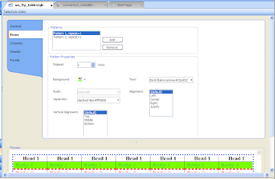
The TableStyle editor hasn’t changed for a while, but has been reorganized in v. 7. Here’s the TableStyle editor in v. 6 for reference:
And here it is in v. 7:

Note several changes…
• The generic term “patterns”, referring to groupings of row/column/etc. properties, is now more element-specific – “row styles”, “column styles”, etc.
• It’s easier to change the sequence in which particular row or column styles should apply in a table. For example, if you created row style 1 with a green background and row style 2 with a red background and then decide to reverse their sequence, you can simply click on either of the styles, then click the up or down arrow to the right of the style.
• Features are now functionally grouped – “Column Properties” and “Background” – rather than appearing somewhat scattered around the editor screen. I believe this improves the overall usability of the editor.
The TableStyle editor’s title bar also adds two features – Medium and Apply Style….
• Medium adds the power of mediums in the regular Stylesheet editor to tables. If you’re new to mediums…
Mediums are alternate groups of properties for alternate outputs in one table style sheet. Let’s say you output to WebHelp and PDF and want to use navy for header rows in WebHelp but black in PDF, and keep all the other table styles the same. You might create one table style sheet with separate mediums for WebHelp and PDF, assign different values to the header for each medium, then tell Flare which medium, and thus header values, to use for which output. For example, you might select your PDF medium to set all header rows to black for a PDF target, and the Default medium to set all header rows to navy for WebHelp – all from one table style sheet.
This can reduce your table style maintenance work since there’s only one table style sheet to maintain and just a few settings to actually define for each medium. Mediums can be confusing if you’re not careful, but the reduction in maintenance work makes them very useful for single sourcing to different formats and output devices.
• Apply Style… lets you select multiple topics, or folders-full of topics, to which to apply a table style sheet. You can also overwrite existing table styles and remove local formatting in the tables. The former is useful; the latter may be enormously useful if you import legacy Word files containing tables.
There’s another feature on the editor that’s easy to miss because of an interface change in Flare 7. In 6, there was only one vertical scroll bar for the TableStyle editor, as shown in the image below.

In 7, below, there are two vertical scroll bars, one for the upper (settings) portion of the editor and one for the lower (preview) portion. Why does this matter?
• One is convenience. In 6, if you wanted to see the options in the lower part of the settings section, you might have to shrink the preview section. In v. 7, you can just scroll down the settings section without changing the size of the preview section.
• There’s also a new feature. Scroll down the settings portion of the editor in 7 and you’ll see an Advanced button at the bottom of the …Properties section. Clicking it displays a Breaks control dialog box that lets you further format the table.

Two more features that many people, including me, have wanted have now been added – the ability to convert tables to text and vice versa. You could convert text to a table by inserting a new table and dragging the text into the cells, but that’s slow. Better to be able to select text and convert it to a table in one step. The feature isn’t immediately obvious; you’ll look on the Table menu for a Convert Text to Table feature and not find it. It’s actually on the Insert Table dialog box in the Text to Table section, shown below, with options for splitting the text on paragraphs, commas, or other markers.
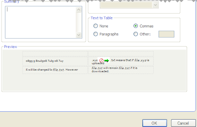
How well it works in practice depends on the cleanliness of the text. Ignoring that issue, this should be a very good productivity improvement feature.
Some other useful new features include merging adjacent tables, not just adjacent cells, and pasting cells from one table into another. You can also merge, split, and clear cells, apply and change cell content styles and cell classes, resize tables, all features that date to v. 6 or earlier and have been retained in v. 7.
The table features also offer two tricks that can fix some annoying problems you may run into. These tricks aren’t new but you may not know about them if you haven’t taken one of the training classes, talked to a consultant, or just experimented a lot.
Trick 1 – Local Formatting In Tables Breaks Table Style Sheets
Ever apply a table style sheet to a table and find that some settings don’t work for some reason? Often, the problem is that the table contains local formatting. This can happen in tables in topics created from imported Word documents, or tables created in Flare and hand-formatted to get a particular look. Local formatting overrides styles in table (or any) style sheets. You can try to fix the problem by playing with the styles, but you may find yourself flailing. Or you can go into code to find and delete the local formatting code, but this can be difficult. (The first figure below shows a little table, the second shows the underlying code. It’s not easy to find the bad code in this.)
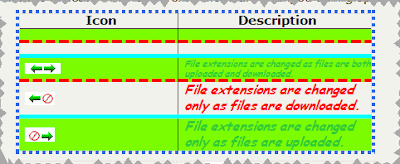
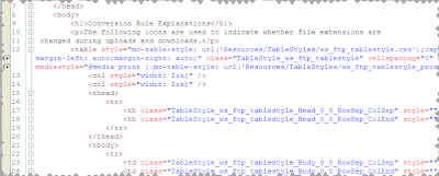
There’s a simpler way. Click in the table in the XML editor and select Table > Reset Local Cell Formatting. This automatically finds and deletes the offending code and the table style works instantly. This feature can fail on very problematic tables, but I find that it generally does work and, when it does, it’s sort of like magic.
Trick 2 – Header Row Settings in My Table Style Sheet Don’t Work
The TableStyle editor lets you define a header row as a separate item with its own distinct styles within a table. However, you may find that your header row styles don’t work on some tables. Often, you’ll find that these tables came in from Word files. In Word, if you’re like me, you count the number of rows needed for a table, then add one more to act as a header row. But Flare sees this as an ordinary row that’s acting as a header, not a programmatically defined header row, so the header styles don’t work. How to add a header row to these tables to get your header styles to work? It’s surprisingly easy.
Step 1 is to add the “Flare-compliant” header row. Click in the table, select Table > Table Properties, make sure you’re on the General tab, and change the Number of Header Rows field from 0 to 1. You’ve just added the programmatic header row. Step 2 is to move the column heads from their current row to the “real” header row. When you do, they take on the styles you defined for the header row in the TableStyle editor. You can then delete the original and now empty header row. That’s it.
Overall, a well laid out set of table manipulation features with some very useful additions.
More to come…
Tables can be troublesome, especially those in topics created by imported Word or Frame files. Flare has had some powerful table features since v. 1, but v. 7 adds some significant extensions. Here’s a quick look at some of what I consider to be the most significant.
Revised Table Style Editor
The TableStyle editor hasn’t changed for a while, but has been reorganized in v. 7. Here’s the TableStyle editor in v. 6 for reference:

And here it is in v. 7:

Note several changes…
• The generic term “patterns”, referring to groupings of row/column/etc. properties, is now more element-specific – “row styles”, “column styles”, etc.
• It’s easier to change the sequence in which particular row or column styles should apply in a table. For example, if you created row style 1 with a green background and row style 2 with a red background and then decide to reverse their sequence, you can simply click on either of the styles, then click the up or down arrow to the right of the style.
• Features are now functionally grouped – “Column Properties” and “Background” – rather than appearing somewhat scattered around the editor screen. I believe this improves the overall usability of the editor.
The TableStyle editor’s title bar also adds two features – Medium and Apply Style….
• Medium adds the power of mediums in the regular Stylesheet editor to tables. If you’re new to mediums…
Mediums are alternate groups of properties for alternate outputs in one table style sheet. Let’s say you output to WebHelp and PDF and want to use navy for header rows in WebHelp but black in PDF, and keep all the other table styles the same. You might create one table style sheet with separate mediums for WebHelp and PDF, assign different values to the header for each medium, then tell Flare which medium, and thus header values, to use for which output. For example, you might select your PDF medium to set all header rows to black for a PDF target, and the Default medium to set all header rows to navy for WebHelp – all from one table style sheet.
This can reduce your table style maintenance work since there’s only one table style sheet to maintain and just a few settings to actually define for each medium. Mediums can be confusing if you’re not careful, but the reduction in maintenance work makes them very useful for single sourcing to different formats and output devices.
• Apply Style… lets you select multiple topics, or folders-full of topics, to which to apply a table style sheet. You can also overwrite existing table styles and remove local formatting in the tables. The former is useful; the latter may be enormously useful if you import legacy Word files containing tables.
There’s another feature on the editor that’s easy to miss because of an interface change in Flare 7. In 6, there was only one vertical scroll bar for the TableStyle editor, as shown in the image below.

In 7, below, there are two vertical scroll bars, one for the upper (settings) portion of the editor and one for the lower (preview) portion. Why does this matter?
• One is convenience. In 6, if you wanted to see the options in the lower part of the settings section, you might have to shrink the preview section. In v. 7, you can just scroll down the settings section without changing the size of the preview section.
• There’s also a new feature. Scroll down the settings portion of the editor in 7 and you’ll see an Advanced button at the bottom of the …Properties section. Clicking it displays a Breaks control dialog box that lets you further format the table.

Two more features that many people, including me, have wanted have now been added – the ability to convert tables to text and vice versa. You could convert text to a table by inserting a new table and dragging the text into the cells, but that’s slow. Better to be able to select text and convert it to a table in one step. The feature isn’t immediately obvious; you’ll look on the Table menu for a Convert Text to Table feature and not find it. It’s actually on the Insert Table dialog box in the Text to Table section, shown below, with options for splitting the text on paragraphs, commas, or other markers.

How well it works in practice depends on the cleanliness of the text. Ignoring that issue, this should be a very good productivity improvement feature.
Some other useful new features include merging adjacent tables, not just adjacent cells, and pasting cells from one table into another. You can also merge, split, and clear cells, apply and change cell content styles and cell classes, resize tables, all features that date to v. 6 or earlier and have been retained in v. 7.
The table features also offer two tricks that can fix some annoying problems you may run into. These tricks aren’t new but you may not know about them if you haven’t taken one of the training classes, talked to a consultant, or just experimented a lot.
Trick 1 – Local Formatting In Tables Breaks Table Style Sheets
Ever apply a table style sheet to a table and find that some settings don’t work for some reason? Often, the problem is that the table contains local formatting. This can happen in tables in topics created from imported Word documents, or tables created in Flare and hand-formatted to get a particular look. Local formatting overrides styles in table (or any) style sheets. You can try to fix the problem by playing with the styles, but you may find yourself flailing. Or you can go into code to find and delete the local formatting code, but this can be difficult. (The first figure below shows a little table, the second shows the underlying code. It’s not easy to find the bad code in this.)


There’s a simpler way. Click in the table in the XML editor and select Table > Reset Local Cell Formatting. This automatically finds and deletes the offending code and the table style works instantly. This feature can fail on very problematic tables, but I find that it generally does work and, when it does, it’s sort of like magic.
Trick 2 – Header Row Settings in My Table Style Sheet Don’t Work
The TableStyle editor lets you define a header row as a separate item with its own distinct styles within a table. However, you may find that your header row styles don’t work on some tables. Often, you’ll find that these tables came in from Word files. In Word, if you’re like me, you count the number of rows needed for a table, then add one more to act as a header row. But Flare sees this as an ordinary row that’s acting as a header, not a programmatically defined header row, so the header styles don’t work. How to add a header row to these tables to get your header styles to work? It’s surprisingly easy.
Step 1 is to add the “Flare-compliant” header row. Click in the table, select Table > Table Properties, make sure you’re on the General tab, and change the Number of Header Rows field from 0 to 1. You’ve just added the programmatic header row. Step 2 is to move the column heads from their current row to the “real” header row. When you do, they take on the styles you defined for the header row in the TableStyle editor. You can then delete the original and now empty header row. That’s it.
Overall, a well laid out set of table manipulation features with some very useful additions.
More to come…
Subscribe to:
Comments (Atom)